
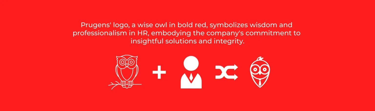
Prugens approached us to rethink their brand from the ground up. They needed an identity that broke away from traditional consulting tropes while maintaining an air of absolute professionalism and trust.
The Challenge
The consulting sector is visually dominated by safe, uninspired corporate blues and generic typography. Prugens wanted to stand out without shouting. The challenge was crafting a visual language that felt intelligent, modern, and distinctively theirs.
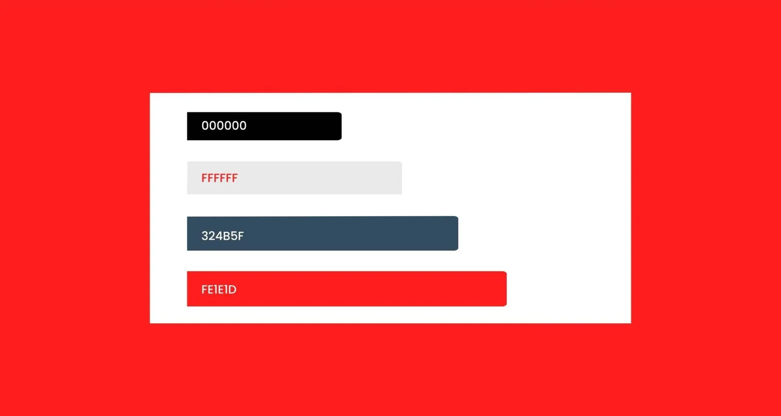
We developed a brand foundation built on striking typography, a refined color palette, and a focus on clarity over complexity.
Founder, Prugens

Visual System
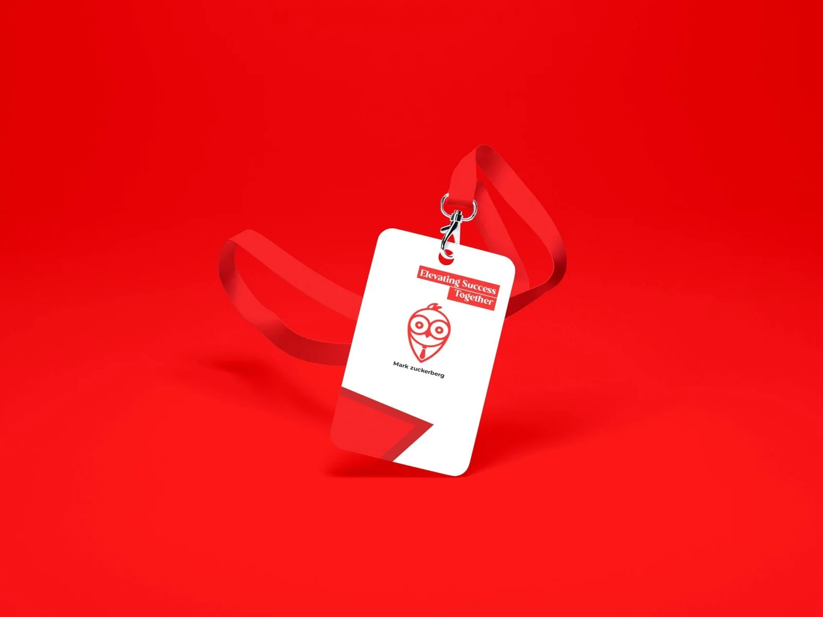
Every element of the Prugens visual system was designed to convey precision. The core logo mark is subtle yet instantly recognizable, scaling effortlessly across all digital and physical touchpoints.
By establishing strict typographic rules and a cohesive layout structure, we ensured that every piece of communication feels considered and impactful.


Founder, Prugens Consulting

Application
From presentation decks and business cards to the core digital platform, the new identity ensures Prugens presents a unified, powerful front to every prospective client.
The resulting brand is not just a cosmetic upgrade—it's a strategic asset that supports their growth and market positioning.

Founder, Prugens Consulting

Outcome
The success of the rebrand was measured in how quickly the new identity was embraced both internally and externally. The Prugens team now moves with the confidence that their brand visually represents the caliber of their work.
We continue to support Prugens with their evolving digital needs, ensuring their brand remains sharp, relevant, and ahead of the curve in the competitive consulting landscape.

Share your brief with us. Our team will come back with a perspective worth hearing.
Share Your Brief →